Best Practices for User-Friendly Website Navigation

When it comes to designing a website, one of the most critical factors for a successful user experience is intuitive and user-friendly navigation. A well-designed navigation system allows visitors to find information effortlessly, explore different sections of the website, and complete desired actions. In this blog, we will explore best practices for creating user-friendly website navigation that ensures a seamless browsing experience for your visitors.
- Clear and Consistent Menu Structure : A clear and consistent menu structure is the backbone of an easy-to-navigate website. By organizing your content into logical categories and placing them in a well-structured menu, users can quickly grasp the hierarchy and flow of your website. Whether you choose a horizontal or vertical menu, ensure it remains consistent across all pages to avoid confusion and facilitate easy navigation.
- Use Descriptive Labels : The labels used for navigation links play a vital role in guiding users. It is essential to use descriptive and straightforward wording that accurately represents the content of the linked pages. Instead of generic labels like “Products” or “Services,” consider more specific labels such as “Our Portfolio” or “Digital Marketing Solutions” to provide clarity and engage users from the start.
- Visible and Accessible Navigation : For effective website navigation, it’s crucial to make navigation elements highly visible and easily accessible. The navigation menu should be placed prominently on the page, either at the top or in a sidebar, ensuring it remains in view as users scroll through the content. Additionally, using hover effects or subtle animations can draw attention to the menu and indicate interactivity.
- Implement a Logical Information Architecture : Creating a logical information architecture allows users to navigate your website seamlessly. Group related pages together under relevant categories, and ensure that the menu structure reflects the relationships between different sections. By organizing your content thoughtfully, users can anticipate where they will find specific information and easily explore related pages.
- Utilize Dropdown Menus Sparingly : Dropdown menus can be a useful tool for providing additional navigation options. However, they should be used sparingly and strategically. Overusing dropdown menus can overwhelm users, causing frustration and making it harder for them to find what they are looking for. Consider utilizing dropdown menus for nested categories or when there is a need to display a large number of options.
- Incorporate Breadcrumb Trails : Breadcrumb trails are a navigational aid that shows users their current location within the website’s hierarchy. By displaying a trail of links representing the path users have taken, breadcrumb trails enable users to navigate backward easily, explore higher-level categories, and maintain context. This feature is particularly useful for websites with deep content structures or e-commerce platforms.
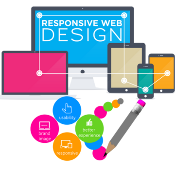
- Mobile-Friendly Navigation : With the increasing use of mobile devices, optimizing navigation for mobile is paramount. Implement responsive design techniques to ensure your navigation menu adapts to different screen sizes and touch interactions. Consider using a collapsible hamburger menu or a mobile-optimized menu that provides a smooth browsing experience on smaller devices.
- Test and Iterate : Implementing best practices for user-friendly website navigation is an ongoing process. Conduct regular usability tests to observe how users interact with your navigation system and gather feedback. Analyze user behavior using tools like heatmaps and user recordings to identify any pain points or areas that require improvement. Iterate based on the insights gained to continually enhance the user experience on your website.
A well-designed website navigation system is a key ingredient in providing a positive user experience. By implementing best practices such as a clear menu structure, descriptive labels, visible navigation elements, and mobile optimization, you can ensure that users find what they are looking for effortlessly. Remember to regularly test and refine


TECHNICAL
Blog
Stay Informed with Our Blog
Our customers come from various industries and backgrounds, and we're proud to serve a diverse range of needs.


